I saw my old car driving around a few weeks ago. It was falling to pieces when I traded it in and that was many years earlier. Intrigued, I looked it up on Gov.uk’s MOT status checker to peek in on its history. The muse struck, the API behind this service can yield a huge amount of data on potentially all vehicles in the country, including mileage and postcode area.
Google-fu uncovered annual anonymised MOT results data has been published by Gov.uk as part of the UK Governments open data strategy. This consists of large csv files, many of around 3GB in size each. To large for humans to read, but using data analysis what can this seemingly dull treasure trove tell us about how the country uses its vehicles?
Note on “Postcode Area”
The data anonymised vehicle locations to postcode area. Essentially this is the first one or two letters of the post code and closely aligns to counties. It is not strictly the same as counties, as such throughout this piece I use the postcode area (PCA) names and not county names. As ever, more details can be found on Wikipedia.
Prep
The data has been published as a csv file however some of the years have been exported incorrectly for this format. In a small number of cases the vehicle’s model field itself contains commas making it impossible to read in as a csv vile as some rows contain too many columns. I first had to pre-process some files to remove the extra commas line by line to allow the file to be parsed correctly.
Unique Vehicles
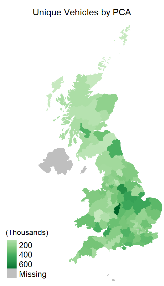
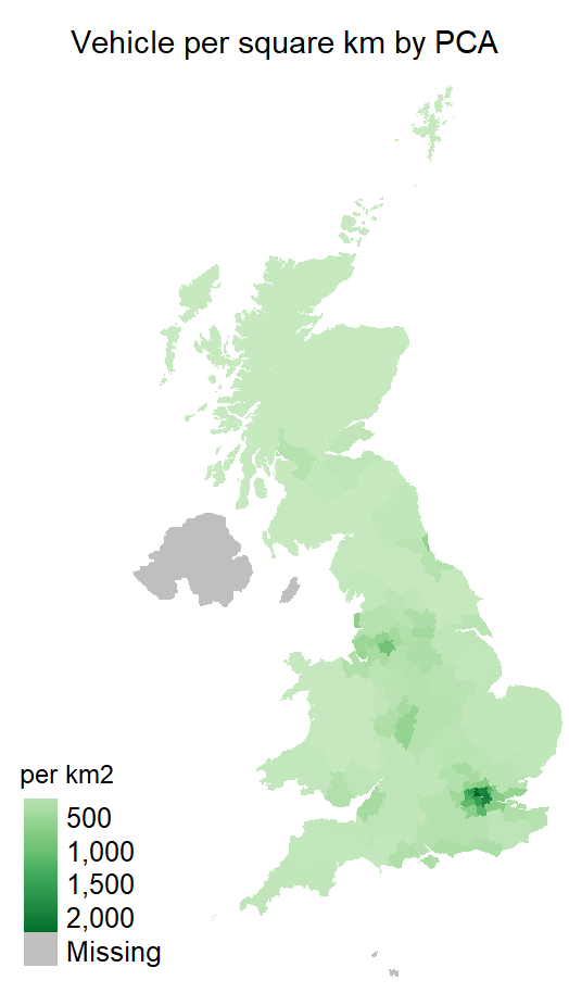
The data is taken from MOT which does have some limitations. It will not be all vehicles, only those MOT’d in a calendar year. Some vehicles also have multiple entries, most commonly if it failed it’s first test and was re-tested after repairs. Using the anonymised vehicle IDs and postcode areas we can start to plot the distribution of vehicles over the UK both in terms of raw quantity of vehicles and vehicles per square kilometre.
These and other plots are presented as layers of an interactive map at the end of this post.
Birmingham is the postcode area with the most vehicles, by a significant amount. Although the London areas each have few vehicles, the small sizes of these areas leave them with the highest vehicle density. Notably the Birmingham postcode area contains more than just Birmingham city, whilst greater London is spread over a number of postcode areas.
Pass/Fail
As the dataset contains all test results, including pass & fail, we can see which areas have the highest number of vehicles which pass first time
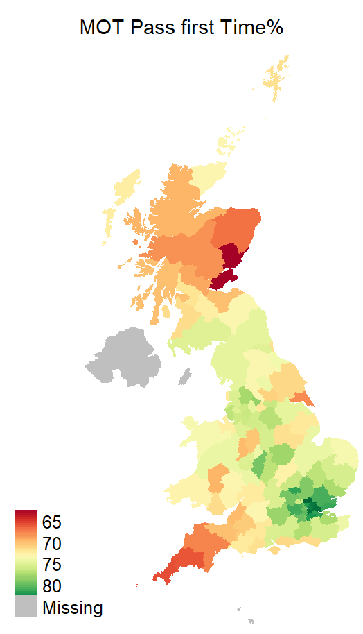
The dataset contains approximately 32 million test results and 26 million unique vehicles. With this in mind it is surprising to see such a variance in pass-rates.
Vehicle Age
The data contains both the date of the test, and the date the car was first used. Using the difference between the two and taking only the highest to prevent old failing cars tilting the statistics, we can see the distribution of vehicle’s age at time of MOT test. Here I also plot a snapshot of MOTed vehicle ages at January 1st of the data’s year.
The first thing to note is an obvious limitation of the dataset, this is MOT data and cars under 3-years old are exempt from an annual MOT test. The rest of the post should be read bearing this in mind.
Secondly we can see younger vehicles are more likely to be MOTed on the anniversary of their first use date, and this trend diminishes as vehicles get older. This makes sense. There is rarely a reason to MOT a car other than it’s mandatory annual re-test however a scan of for-sale listings suggest it is common to MOT a car before selling it. The older a vehicle, the more likely it is to drift from this annual date.
Thirdly, we can see impacts of the financial crisis. If we assume a similar distribution of vehicles are written off each year, the conclusion will be the dip in cars aged 8-10 years (i.e. first registered around 2008-2010) were due to fewer new vehicles purchased in those years.
How does the age of vehicles look on the map?

The higher failing cars in the south-west are indeed older on average than the passing cars in the south east, but the failing cars in Scotland are younger still? What other factors could be in play to explain this?
Fuel Type
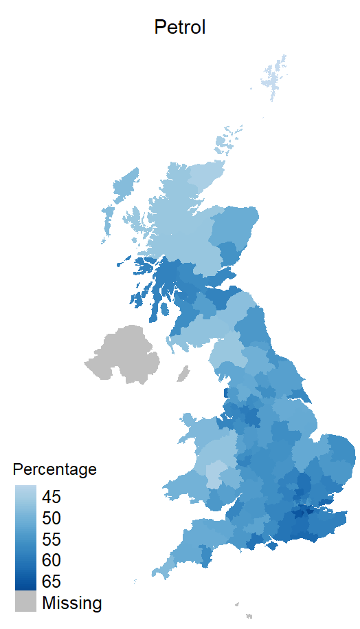
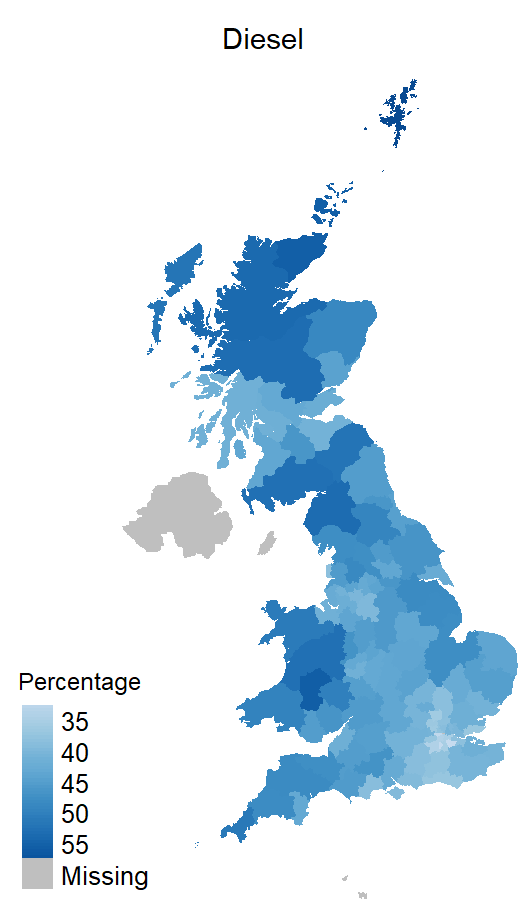
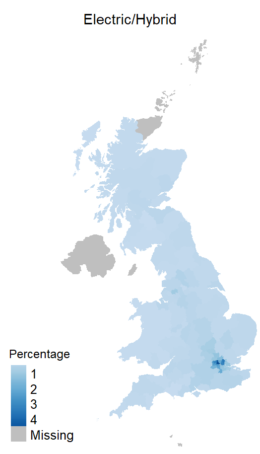
Fuel type is recorded in the dataset. There is a wide range of fuels in use including steam! Petrol & Diesel are the most prolific, here I also combine electric, petrol-hybrid & diesel-hybrid into a third category.
There’s little correlation with the pass-fail rates here, though it is clear London has fewer diesels and more electric vehicles relative to other areas.
Mileage
The data also records mileage at the time of the test. This combined with the vehicles geographic is information I find highly intriguing. I know cars often have multiple owners, sometime in different areas, over their lifetime. To account for this in working out the vehicle’s annual mileage I do not simply divide by its age but instead merge in results from the previous year. I take the mileage and test date from two sequential years to fairly accurately estimate an annual mileage for each of the 26 million vehicles.
There are some exceptions that need to be handled. A minority of test centres appear to record 100,000 miles as 100 miles which in extreme cases resulted in some vehicles being calculated at over 400,000 miles per year and others -140,000 miles. There are very few of either extreme, sufficiently so for me to judge them statistically insignificant and so are filtered out. There may still be some errors for example recorded as ~100 miles having actually done 100,000 however the below charts suggest this minority has little impact on the trends.

This kind of “double-curve” distribution leads me to think the data can be split into two large demographics. There is a peak at around 2,000 miles indicates a large portion travelling short distances. If we were to remove this the plot, from 5,000 miles upwards shows a pretty common distribution with fewer cars doing more mileage.
With no socio-economic breakdown of the data I can only speculate, but based on a brief glance at employment data it is not a wild leap to think the two major demographics are commuters in full time employment averaging around 7,500 miles per year, and people not in full time employment travelling less at around 2,000 miles per year.
Unfortunately, I cannot find publicly available data to confirm this theory.
What’s that done to the map?
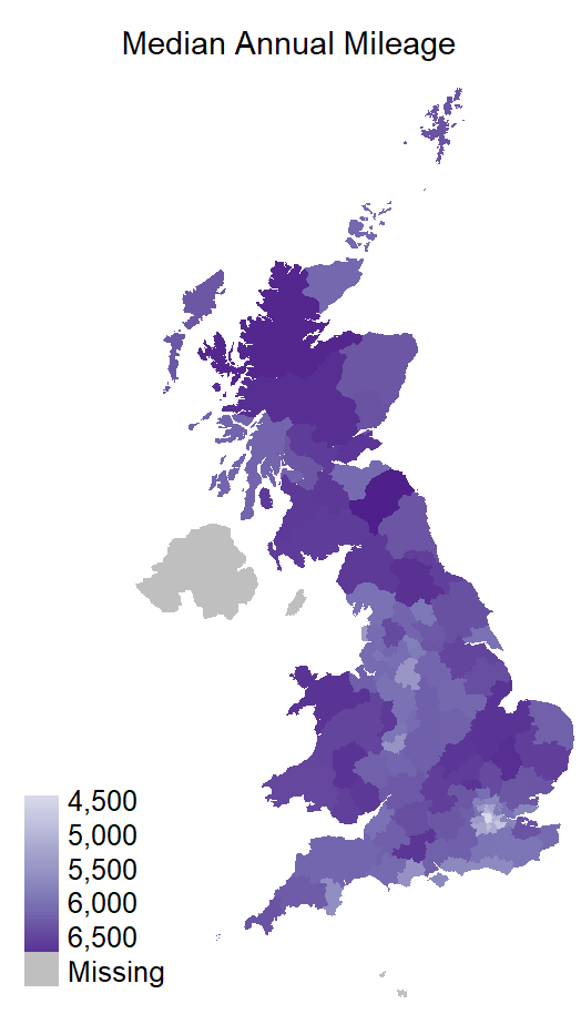
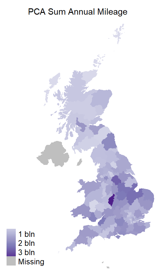
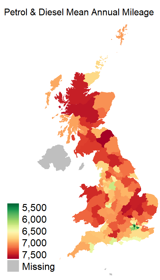
I consider both mean & median mileage per postcode area, and the sum of all mileage per postcode area. Plotting this on maps has inherent flaws; most notably longer journeys are spread over a wide route of postcode areas, however averaging this many vehicles should hopefully allow trends to appear.
The more rural areas have higher average mileage per vehicle.
Pull it together
Whilst I have enjoyed plotting map-graphs, a scatter-plot make it easier to compare multiple variables at the same time. The below plots age against pass-first-time percentage with one dot per postcode area. The size of the dot represents the number of vehicles and the colour the annual mileage.

I see three clusters here. A small cluster in the bottom left, another small cluster towards the top, and a larger cluster in the centre to centre-right.
At the bottom left we have younger vehicles failing relatively highly doing higher mileage. At the top we have a few old cars doing relatively little mileage and also failing relatively highly.
The centre group has an odd trend, older cars passing more? I suspect there is more to this. I can imagine cars pottering round a city incur less wear than those in rural Scotland and Cornwall. A possible extension to this analysis would be to look at the types of failure occurring, are some postcode areas simple breaking cars?
I have not been able to prove reason why the south east has a higher MOT pass rate conclusively, but I have highlighted several possible contributing factors.
The Big Smoke
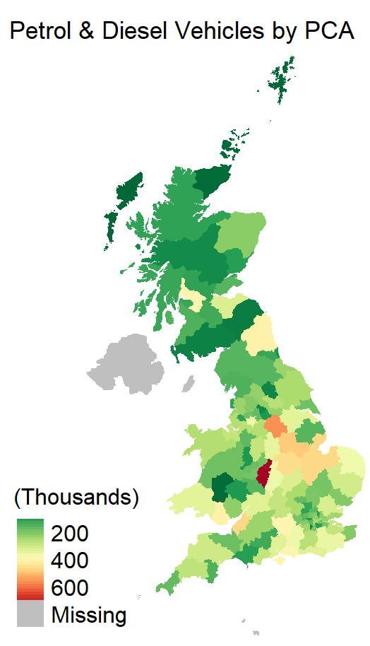
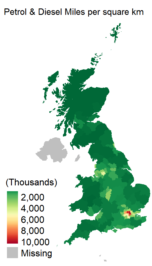
Earlier I plotted the total mileage of all vehicles in a postcode area. By dividing it by the postcode area’s areas we can use it as a crude proxy for vehicle pollution. It will not be a true measurement for several key reasons: by their nature cars move between areas, different cars have different emission characteristics, and it does not account for average speed & idling.
We know London has a higher proportion of electric vehicles. For my final plots I consider just petrol & diesel vehicles to show this proxy for air pollution.
As promised, the interactive version can be found here.
